 Binary Cipher
HTML:
<html>
<head>
<link href=”../css/bootstrap.min.css” rel=”stylesheet” type=”text/css”></link>
<link href=”../css/caroseral.css” rel=”stylesheet” type=”text/css”></link>
<script src=”../js/jquery-2.2.3.min.js” type=”text/javascript”></script>
<script type=”text/javascript”>
$(document).bind(‘mobileinit’,function(){
$.mobile.changePage.defaults.changeHash = false;
$.mobile.hashListeningEnabled = false;
$.mobile.pushStateEnabled = false;
});
</script>
<script src=”../js/jquery.mobile-1.4.5.min.js” type=”text/javascript”></script>
<script src=”../js/bootstrap.min.js” type=”text/javascript”></script>
<script src=”../js/caurosal.js” type=”text/javascript”></script>
</head>
<body>
<div class=”container”>
<div class=”carousel slide” data-ride=”carousel” id=”myCarousel”>
<!– Indicators –>
<ol class=”carousel-indicators”>
<li class=”active” data-slide-to=”0″ data-target=”#myCarousel”></li>
<li data-slide-to=”1″ data-target=”#myCarousel”></li>
<li data-slide-to=”2″ data-target=”#myCarousel”></li>
</ol>
<!– Wrapper for slides –>
<div class=”carousel-inner” role=”listbox”>
<div class=”item active”>
<img alt=”Chania” src=”../images/img1.jpg” />
<div class=”carousel-caption”>
<div class=”flash-board”>
<h1>
Why do we use it?</h1>
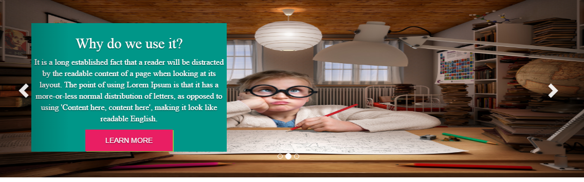
It is a long established fact that a reader will be distracted by the readable content of a page when looking at its layout. The point of using Lorem Ipsum is that it has a more-or-less normal distribution of letters, as opposed to using ‘Content here, content here’, making it look like readable English.
<div class=”grp-button”>
<span class=”more”>learn more</span>
</div>
</div>
</div>
</div>
<div class=”item”>
<img alt=”Chania” src=”../images/img2.jpg” />
<div class=”carousel-caption”>
<div class=”flash-board”>
<h1>
Why do we use it?</h1>
It is a long established fact that a reader will be distracted by the readable content of a page when looking at its layout. The point of using Lorem Ipsum is that it has a more-or-less normal distribution of letters, as opposed to using ‘Content here, content here’, making it look like readable English.
<div class=”grp-button”>
<span class=”more”>learn more</span>
</div>
</div>
</div>
</div>
<div class=”item”>
<img alt=”Flower” src=”../images/img3.jpg” />
<div class=”carousel-caption”>
<div class=”flash-board”>
<h1>
Why do we use it?</h1>
It is a long established fact that a reader will be distracted by the readable content of a page when looking at its layout. The point of using Lorem Ipsum is that it has a more-or-less normal distribution of letters, as opposed to using ‘Content here, content here’, making it look like readable English.
<div class=”grp-button”>
<span class=”more”>learn more</span>
</div>
</div>
</div>
</div>
<!– Left and right controls –>
<a class=”left carousel-control” data-slide=”prev” href=”https://www.blogger.com/blogger.g?blogID=6276864155662020515#myCarousel” role=”button”>
<span aria-hidden=”true” class=”glyphicon glyphicon-chevron-left”></span>
<span class=”sr-only”>Previous</span>
</a>
<a class=”right carousel-control” data-slide=”next” href=”https://www.blogger.com/blogger.g?blogID=6276864155662020515#myCarousel” role=”button”>
<span aria-hidden=”true” class=”glyphicon glyphicon-chevron-right”></span>
<span class=”sr-only”>Next</span>
</a>
</div>
</div>
</div>
</body>
</html>
CSS:
  *{
   margin: 0;
   padding: 0;
   border: 0;
  }
  .carousel-inner > .item > img,
  .carousel-inner > .item > a > img {
      width: 100%;
      height:350px;
  }
  .container{
    width: 100%;
    margin: 0;
    border: 0;
    padding: 0;
    position: relative;
  }
 .carousel-inner{
  max-height: 350px;
  }
.flash-board{
  position: absolute;
  background:#009688;
  max-width:380px;
  max-height: 250px;
  text-align:center;
  color:#ffffff;
  top: 20px;
  left: 100px;
  padding: 5px;
}
.grp-button{
  text-transform: uppercase;
  background:#E91E63;
  max-width:170px;
  height:42px;
  box-shadow:2px 1px #8BC34A;
  margin:0 auto;
}
.more{
vertical-align: middle;
line-height: 42px;
}
.carousel-caption{
 max-width: 1200px;
 position: absolute;
 margin: 0 auto;
  top: 30px;
  left: 0;
  right: 0px;
}
h1{
 font-family: Source Sans Pro Regular;
 font-size: 28px;
}
p{
  font-family: Source Sans Pro Light;
 font-size: 12pt;
 line-height:1.4;
}
@media screen and (min-width: 480px) and (max-width: 899px)  {
  .carousel-caption{
   left: 0px;
    right: 0px;
  }
}
@media screen and (max-width: 479px){
  .carousel-caption{
   left: 0px;
    right: 0px;
   top:10px;
   max-height: 162px;
  }
  .carousel-control{
   display: none;
  }
  .flash-board{
    top: 5px;
    left: 5px;
     max-width:200px;
     max-height: 162px;
  }
  .grp-button{
   width: 100px;
   height: 30px;
  }
  .more{
   line-height: 30px;
  }
  h1{
   font-size: 15px;
  }
  p{
   font-size: 13px;
   line-height: 1;
  }
}
JS:
//For Mobile swipe
$(document).ready(function() {
     $("#myCarousel").swiperight(function() {
        $(this).carousel('prev');
       });
     $("#myCarousel").swipeleft(function() {
        $(this).carousel('next');
    });
});
Here are the some of the book recommendations :